The Design System... of top Design Systems
Save a lot of time in researching, defining and creating your UI components by synthesizing all the wisdom of the most popular Design Systems and UI libraries in one place.
Our researching process
Check out the step-by-step process of extracting and documenting UI components from top systems.
Annual Top 20 Systems
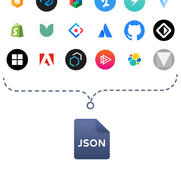
Every year, we select the top 20 best Design Systems and UI libraries. This choice is based on several criteria: a survey conducted among hundreds of developers and designers, popularity, the number of components, whether they are up-to-date or not, and, of course, our experience of over 5 years in crafting UI components.

Manual Review and Consolidation of Patterns
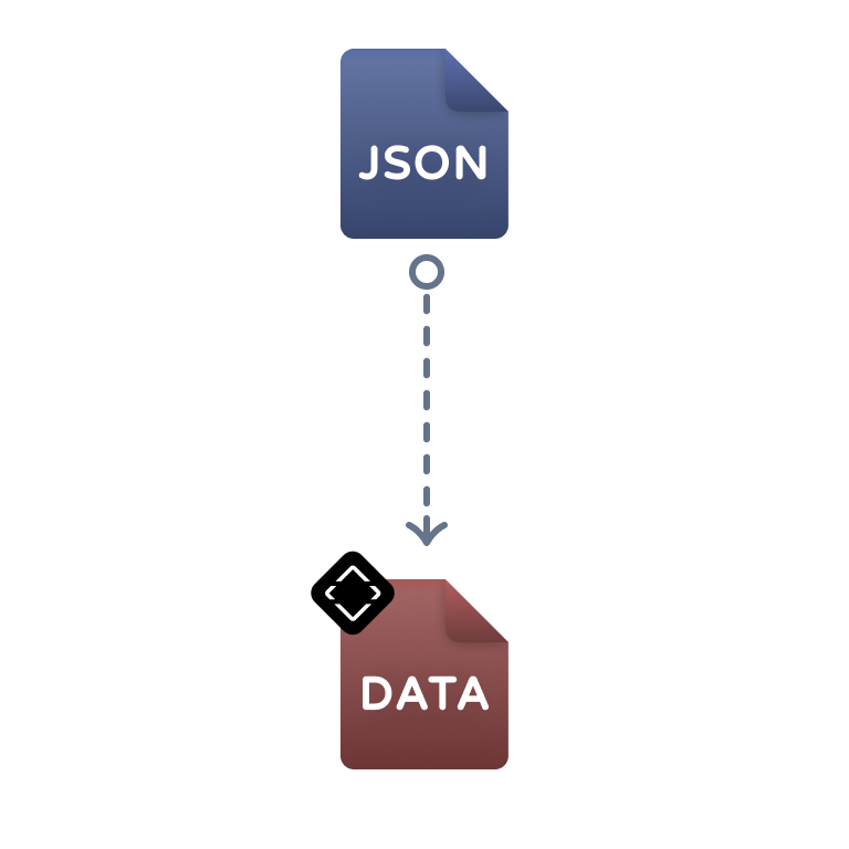
For each component, we manually reviewed the 20 systems one by one, looking for a repeating pattern. We observed the way they name the component, how they define its props and anatomy, and, above all, the best practices. Finally, we consolidate all this data into a single file. e.g. modal_consolidate.json.

Identify a common UI Pattern
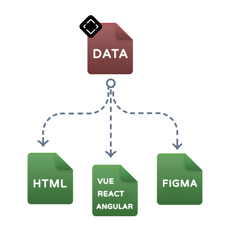
Identify a common pattern and synthesize these into a new file that defines the UI component in detail, including props, anatomy, alternative names, among other aspects. In UI Guideline, you'll be able to find the details of each component in one place.

Save hours of time and effort
With UI Guideline, we save you hours of research and definition of your own components. For example, when you need to define or create a Sidebar component from scratch, you will no longer have to review system by system. Here you'll find all the necessary information to define your Sidebar, based on the wisdom of the best systems of the year.

60 Unique Components:
Unveiled Through Extensive Research
Explore 60 components analyzed from 20 design systems and UI Library, offering you refined insights and practical design solutions.
Over 6,700+ used it!
Don't just take our word for it — the buzz on social media speaks volumes!
Marvel
@marvelapp
UI Guideline ( @uiguideline ) - A guide to standardise UI components naming https://buff.ly/2X0FfIL
A descriptive alt text for an image or video
UI Adrian
@uiuxadrian
Every UX/UI designer should know these websites!
- 1. colorhunt .co - beautiful color palette generator
- 2. stocksnap. io - free stock photos
- 3. uiguideline .com - standardize your design components!
Share it with your friends! Thanks 💙
Vitaly Friedman 🇺🇦 🏳️🌈
@vitalyf
💎 UI Components Handbook (uiguideline.com) is a useful repository for UI components, based on real-life examples and documentation from design systems. Neatly grouped and tagged, with possible names, properties, HTML structure and anatomy. By @uiguideline . #ux #design
Jan Toman
@HonzaTmn
I just discovered http://uiguideline.com – a small, but superhelpful resource for design systems.
Give @uiguideline a follow, help it grow! 🚀 Because naming is hard 🙃
percalus
@percalus.design
✨ jennie § yip ✨
@jenniesyip
OMG I love this, why have I never seen this massive audit before! 😍 https://open-ui.org/analysis/component-matrix
Also, I love how @openuicg and @uiguideline are doing the competitive analysis for us: https://open-ui.org/components/Breadcrumb https://uiguideline.com/components
Yes, #designsystems life is full of audits. 🕵🏻♀️
anikaputriii
@anikaputriii
UX Database
@uxdatabase
#12 Issue released 🐦
This week top stories → GPT-3 Design Hype "@Prototypr
→ Design Docs at Google "@cramforce
→ Visual Builder for React "@plasmicapp
→ UI Guidelines "@uiguideline
and many more ☺ "@templatery @relayops
Read the #12 Issue: "https://buff.ly/30SVzfM
UX Database Top Stories Image
DΞNYS SΞRGUSHKIN
@sergushkincom
- UI Guideline
@uiguideline is a guide to standardize the design/code of user interface components. The site simplifies the work and reduces research time.
UI Guideline screenshot
James Young
@jydesign
The @uiguideline library is growing rapidly and is a helpful concept "UI Components Handbook - The definitive guide to standardize the design/code of the UI Components based on the 39 most popular Reference Systems." https://uiguideline.com/components
UI Guidelines Screenshots Components
Product Disrupt
@ProductDisrupt
Product Disrupt Half-Monthly – Aug 2020 | Part 1 featuring @uiguideline by @seruda
See the issue here & subscribe 👇🏼 https://bit.ly/Product-Disrupt-76
#design #newsletter
A descriptive alt text for an image or video
Ozan Öztaskiran
@ozanoz
✤ DESIGN SYSTEMS → @blvdmitry
- @hi_drozdenko
✤ FRAMER → @BlessCreatics
✤ INSPIRATION → @uiguideline
- @Cruip_com
✤ LEARNING → @guidetouxr - @lexinamer - @SarahFossheim - @benjbach
Designer.tips
@getdesignertips
#Designers, create the best UI with #UIGuideline - a powerful web component library that simplifies web app development – now available in our Tool Collection! #webdevelopment #UIEnhancement #DesignTools
Visit: http://designer.tips/tools/
Designer.tips
@getdesignertips
#UI #guideline helps with naming the components. Make your choice based on examples from existing #opensource design systems, styleguides and pattern librararies. Great tool for modern #frontend development. /cc @uiguideline
https://uiguideline.com
UI Guideline Screenshot Possible names
Koncepted
@koncepted
5 must know website for UI UX designers:
- 📌 colorhunt .co — color palettes
- 📌 freebies .bug — useful resources about web design
- 📌 siteinspire .com — to find inspiration
- 📌 uiguideline .com — UI design principles
- 📌 shapefest .com — 3D illustrations
kientr.ux
@kientr.ux
Jan Mraz
@janm_uiux
If you’re a UX UI designer, you need to know these websites!
- 1.fffuel .co for SVG patterns
- 2.artboard .studio for animated mockups
- 3. uiguideline .com for UI design principles
Retweets are highly appreciated! 💜
Sil Bormüller
@svorklab
UI Guideline - The definitive guide to standardize the UI Components naming https://buff.ly/3hxAE8I #designsystem #designsystems
UI Guideline Screenshot Possible names